Meet Alpharetta Health & Wellness
A vibrant network of wellness opportunities throughout the city, fostering wellbeing through free and affordable programs that welcome residents of all ages and abilities.
Visual Identity | Logo Design | Logo Suite | Branded Concepts


Brand Story
From sunrise yoga at the city center to mindful movement along the scenic Greenway, the City of Alpharetta creates space—and plenty of it—where neighbors become workout partners, strength builds, stress melts away, and movement becomes joyful, regardless of experience level. By removing barriers and making wellness accessible, the City transforms healthy living into a sustainable lifestyle supported by both nature and the community.
“Take care of your body, it’s the only place you have to live.”
—Jim Rohn
Visual Identity
When the City approached me to brand their health and wellness division, I knew it had to capture the uplifting spirit and culture of wellbeing that has always existed. Having spent much of my life in and around Alpharetta, I wanted to create something authentic that would resonate with both longtime residents and newcomers. This community has shown a real, lasting commitment to wellbeing, so the design needed that same timeless quality.

Logo Design
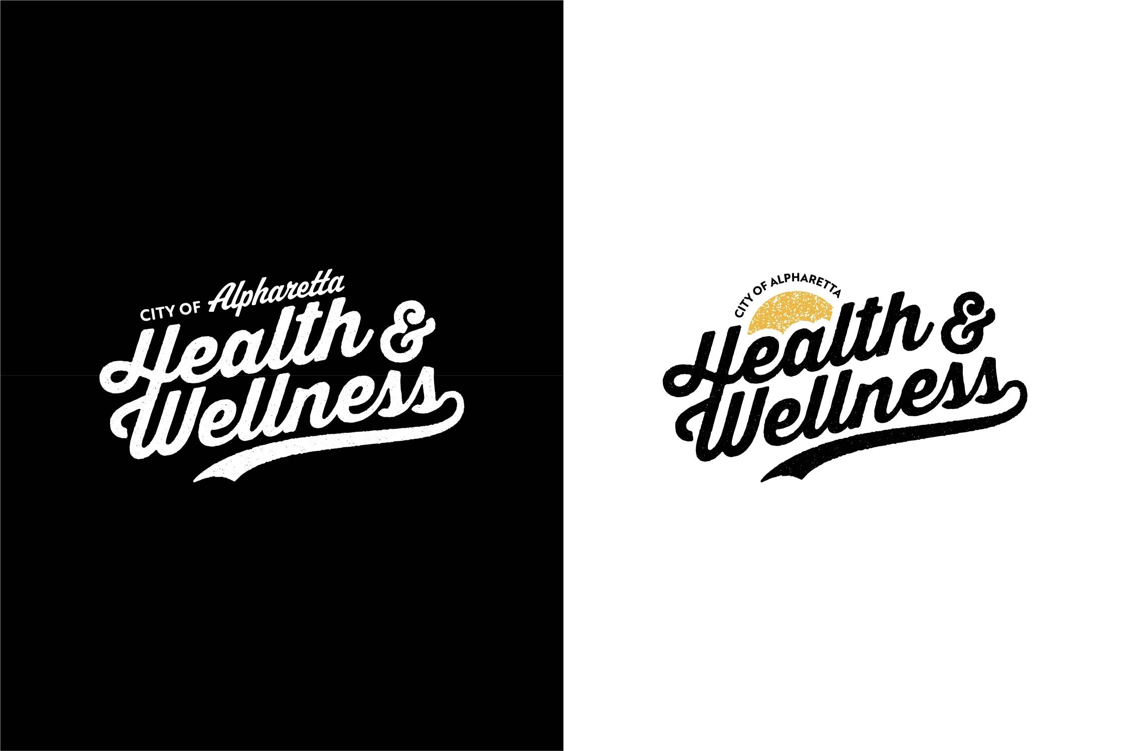
I wanted the logo to feel alive—to capture the feeling when you're out on the Greenway in the early morning with the sun just coming up. The smooth, upward trailing elements show how wellness lifts us up, while the organic textures of “imperfect” edges and stamps ground us in the natural world.

Adaptive Logo Suite
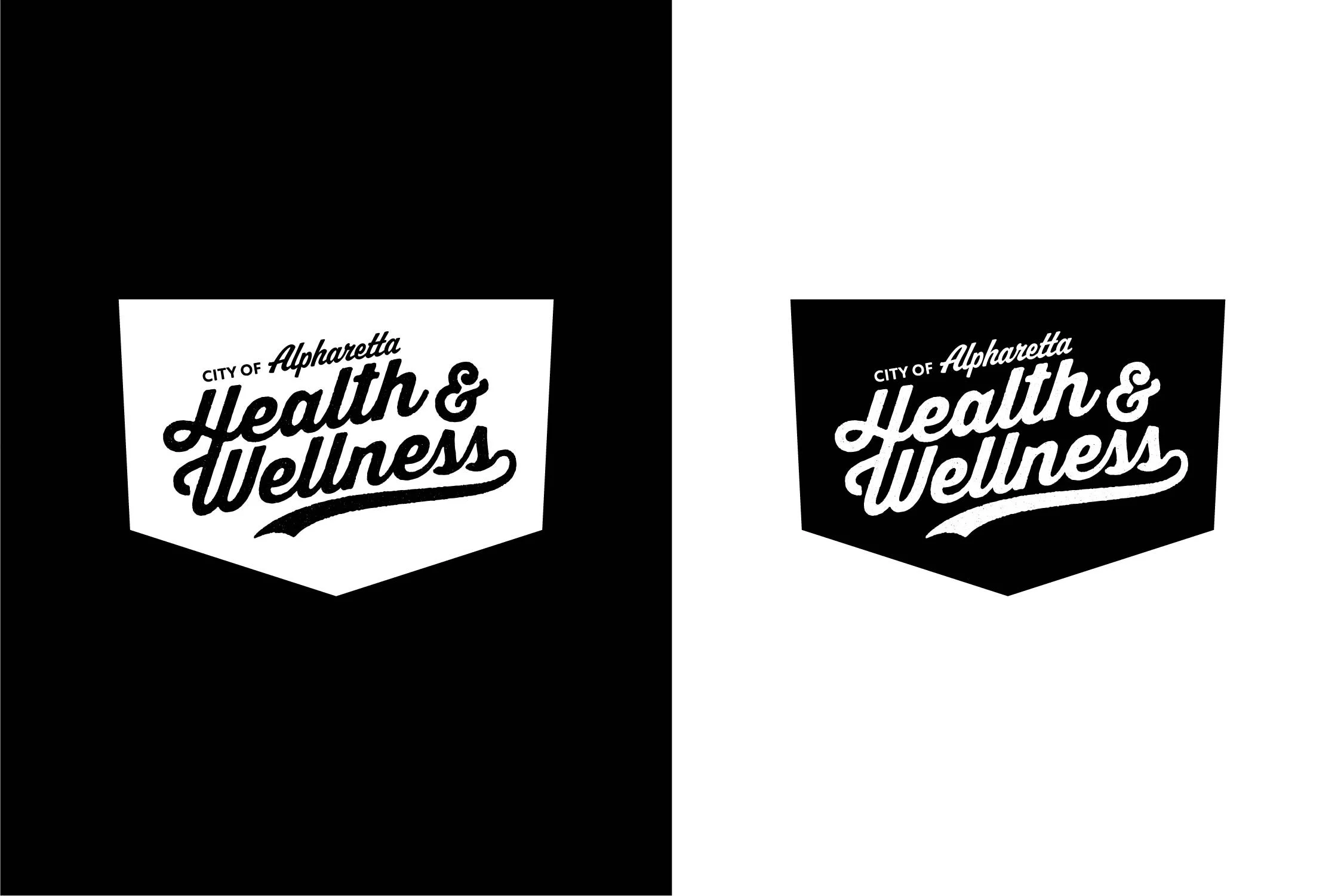
One of the key objectives was seamless integration into the City’s existing brand guidelines. By adapting a secondary variant to fit the established pentagonal framework, the logo maintains core visual elements across digital platforms, print materials, and environmental applications.

Color Palette
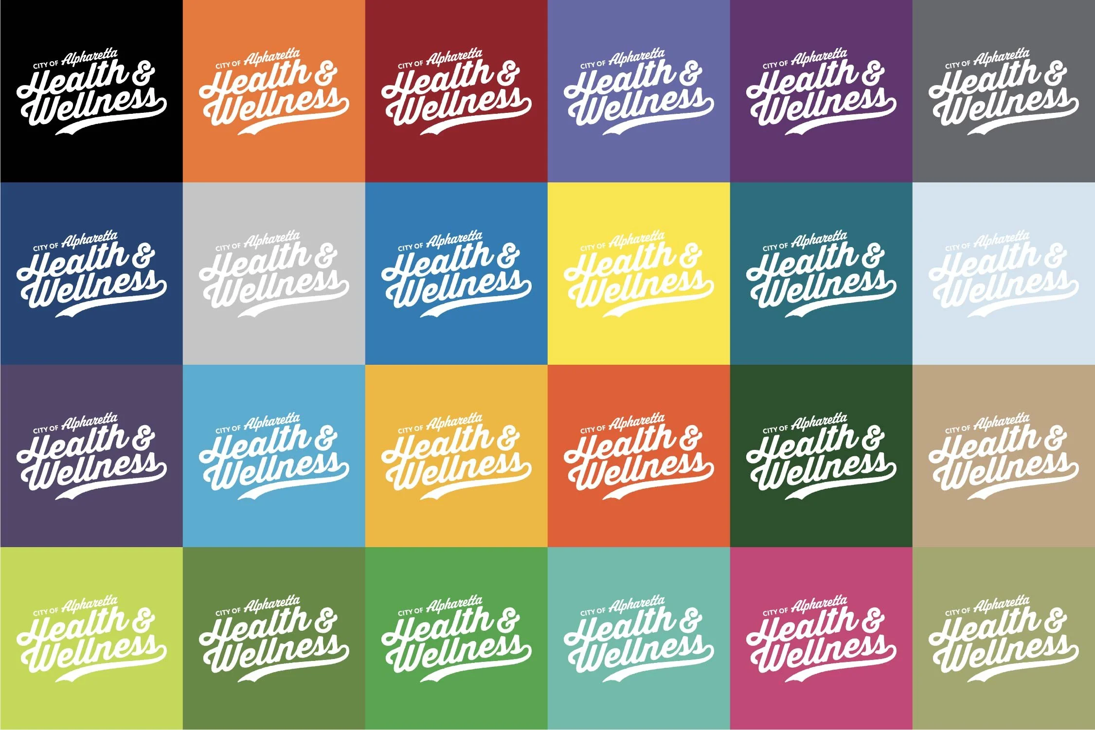
To support Alpharetta’s existing color palette, the logo features heavy strokes and swashes in a compact lockup to ensure high contrast and visibility across a wide variety of colors. This versatility allows the wellness identity to merge with the established visual language while maintaining its own distinctive character.
Print Concepts

